The Girl in Me
Artist Statement
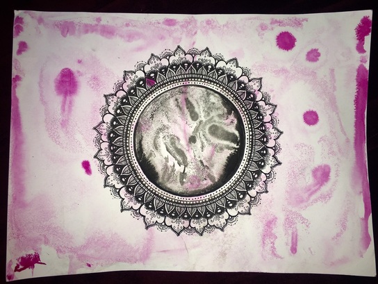
In the beginning of this project I always had an idea to do something with shading because in my artist Siobhan’s art, she had clothe that would drape and create a lot of shading and it was really speaking to me. I started creating this pieces with water colors but then I felt like it wasn’t really me and it was very dark. So I then thought about what Siobhan is actually symbolising in her piece, femininity. So I created this piece named The Girl in Me. I chose to create the background pink and very watercolor like, how in some places it is darker and in other is lighter. This color of pink represented girls and the shades were kind of symbolising me that in some places I am very strong and can be powerful but in some I am weak and empowered by something personal. In the middle there is black kind of like the watercolor effect again where there is dark and light contrast, the difference about this is that it is in a circle. A circle tends to symbolize different things like a universal symbol with extensive meaning. It represents wholeness, the infinite, eternity, timelessness, all cyclic movement..etc. I was kind of thinking it like a sonogram, and that it was a girl in the womb that was going to be another life, a girl's life. I chose a circle because I wanted to prove my point that women or girls have the power to transform the world. I also decided to create little doodles around the circle because I was again describing me as a girl because I am very creative and thought with the little doodles it looked very detailed and abstract and I wanted to put some of myself in the piece.
The materials I used were pigment based drawing ink because it creates a faded spread effect that I exactly wanted and it was water proof which was better because I layer another color on top. I also used ink pens because I wanted to create black smooth full lines.
This art piece has Balance because there is different varieties of textures in my piece. For example the background has spread out effect, the middle circle has more of shading spread everywhere, and along the circle is many different doodles creating a unique detailed part.
This art piece has Emphasis because it is very unique and eye catching because of the colors and textures. You don't really often see things like this and named very thoughtfully that you have to look into to it.
This art piece has Variety because it has a lot of elements of design, by the simplicity and all the little details.

